- Notes from Kasia
- Posts
- 🖌️ Learn how I create my visuals
🖌️ Learn how I create my visuals
Process, tools, behind-the-scenes, lessons learnt
Kasia Kowalewska
August 30, 2024
Read time: 6 minutes.
You don’t need to be a designer to create visuals that stop the scroll. As a non-designer, I’m inviting you behind the scenes to share my creative process, tools, and key lessons I've learned from creating visuals you’ve likely seen on social media.
My creation process is based on three simple steps:
1. Spotting and capturing ideas.
2. Working with ideas.
3. Creating visuals.
Let me guide you through each of them!
Step 1: Spotting and capturing ideas
Great visuals start with great ideas.
To not miss any moment of inspiration, I note every idea as soon as it pops up. Otherwise, it’s gone forever.
If you make it a habit to jot down your ideas, over time, you'll build a bank. This is the go-to resource when I'm ready to create, need inspiration or stuck on what to post.
I don’t judge my ideas. Even if they seem silly initially, I jot them all down—you never know which one might spark something great.
My inspiration comes from everywhere—experiences, reflections, reading, daily work, casual coffee chats, and even everyday objects.
Look at this zipper below. For quite some time, I wondered how to visually present the importance of including stories in the campaign so they connect with the audiences. Then, one morning, I zipped my jacket before leaving for work. Eureka…!
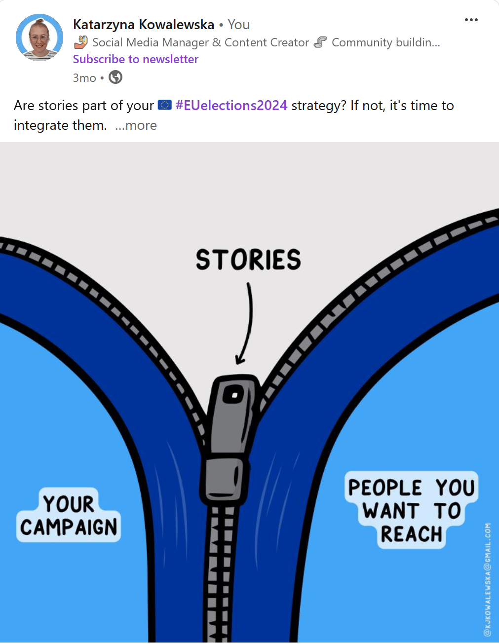
You can draw inspiration from everyday objects and situations.
I keep my ideas organized in Notion, where I can easily add new thoughts, access them from any device and even embed rough sketches. But you don’t need fancy tools—paper and pencil will work, too. The key is finding a system that suits you and allows you to capture your ideas as they come.
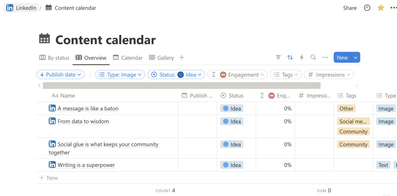
I keep my ideas, drafts and published posts in one Notion database.
With a growing bank of ideas, the next step is to fine-tune them into something worth sharing.
Step 2: Working with ideas
I regularly review my captured ideas to refine, validate, and decide which ones could be turned into visuals.
Here is the checklist for working with my ideas:
Fine-tuning: I strip the idea down to its core message. Each visual should deliver one sharp, clear takeaway. To test this, I ask myself if the idea can be boiled down to a straightforward sentence or an answer to a question. If it feels too complex, I break it into multiple ideas that can stand on their own.
Verifying the relevance: I put myself in my audience’s shoes and ask, “Will this be helpful? Interesting? Novel? Can they apply it immediately?”. I aim for reactions like “Yesss! Me too!”, “This is what I needed“ or “I’ve never thought of it that way.” This validation ensures that the content is meaningful and valuable.
Deciding how to go about it: Finally, I decide whether the idea would benefit from a visual representation. I create visuals only if the concept can deliver the message quickly and be enhanced by a visual metaphor. The goal is to make the idea instantly understandable, engaging, and memorable.
And here’s how this checklist played out in real life.
The visual below started with a rough idea of linking social media marketing with Halloween. I wanted to play with the concept of spooky artefacts to highlight how social media marketing can sometimes feel just as daunting. From the start, I knew this theme had the potential for an engaging design, especially given Halloween’s inherently visual nature.
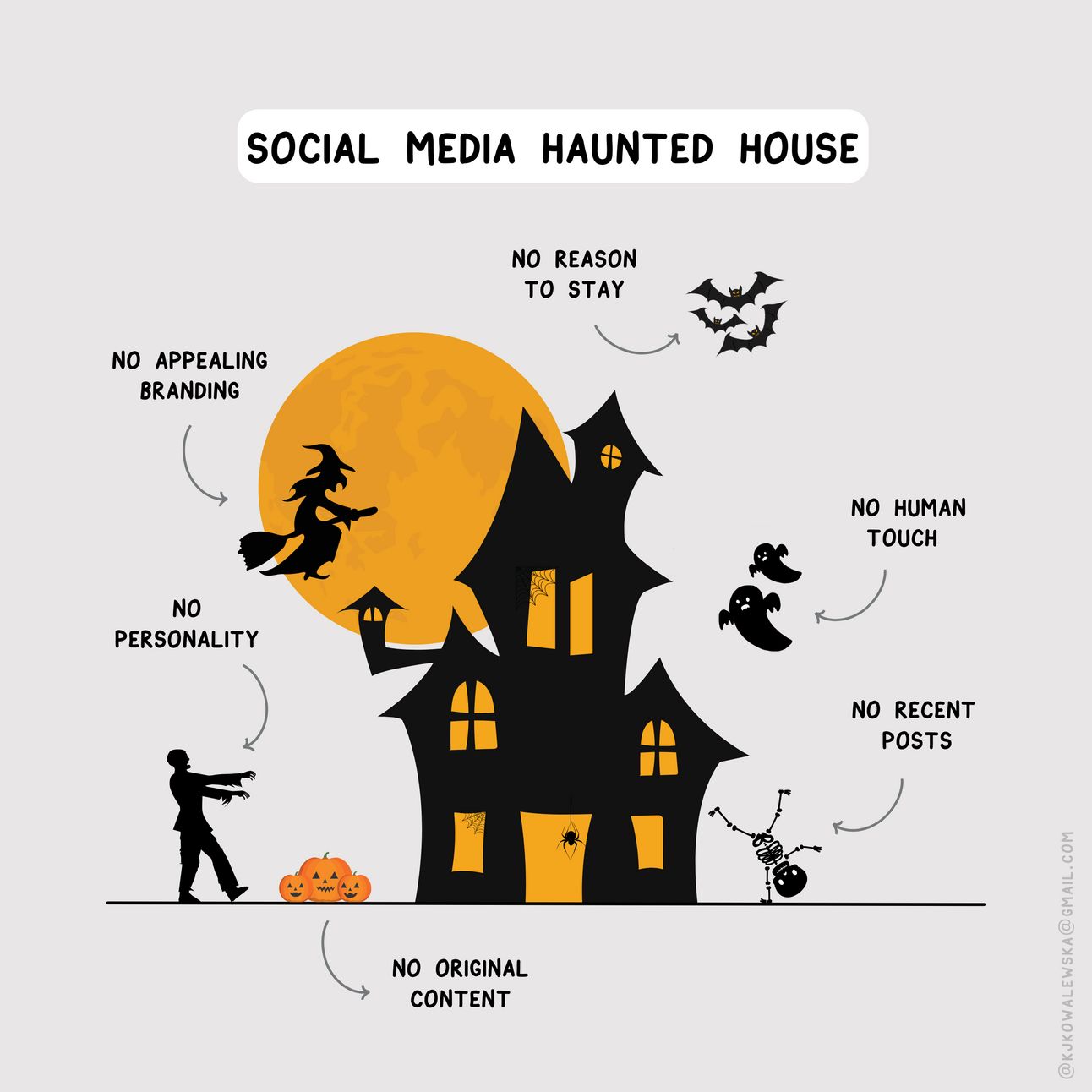
Is your social media spooky?
During the fine-tuning stage, I narrowed down the concept: comparing poorly executed social media to a haunted house—something that’s confusing, chaotic, and a little frightening. I validated the idea by considering how relatable this analogy would be for other social media marketers who often struggle with their organisations’ online presence.
The haunted house metaphor illustrated the challenges and gave the message a playful, memorable twist.
The result was a design that compared various aspects of bad social media to haunted house features, like a zombie with no personality or an ugly witch symbolising a lack of appealing branding.
The caption that accompanied the visual listed concrete steps to escape the social media haunted house if you ended up in one.
It took me a few weeks to develop this idea, so I want to emphasise one more thing: incubation.
Not every idea clicks right away—in fact, they rarely do. Sometimes, stepping away and letting ideas develop naturally is the best approach. Those “Eureka!” moments often come when you least expect them.
Trust the process, be kind to yourself, and give your ideas time.
With the idea refined and validated, it’s time for the fun part—bringing it to life on screen.
Step 3: Creating visuals
I use Canva for its simplicity when designing, but I recently started learning Figma. Whether you’re using Canva, Figma, or another tool, it's most important to find one that is user-friendly and matches your skill level.
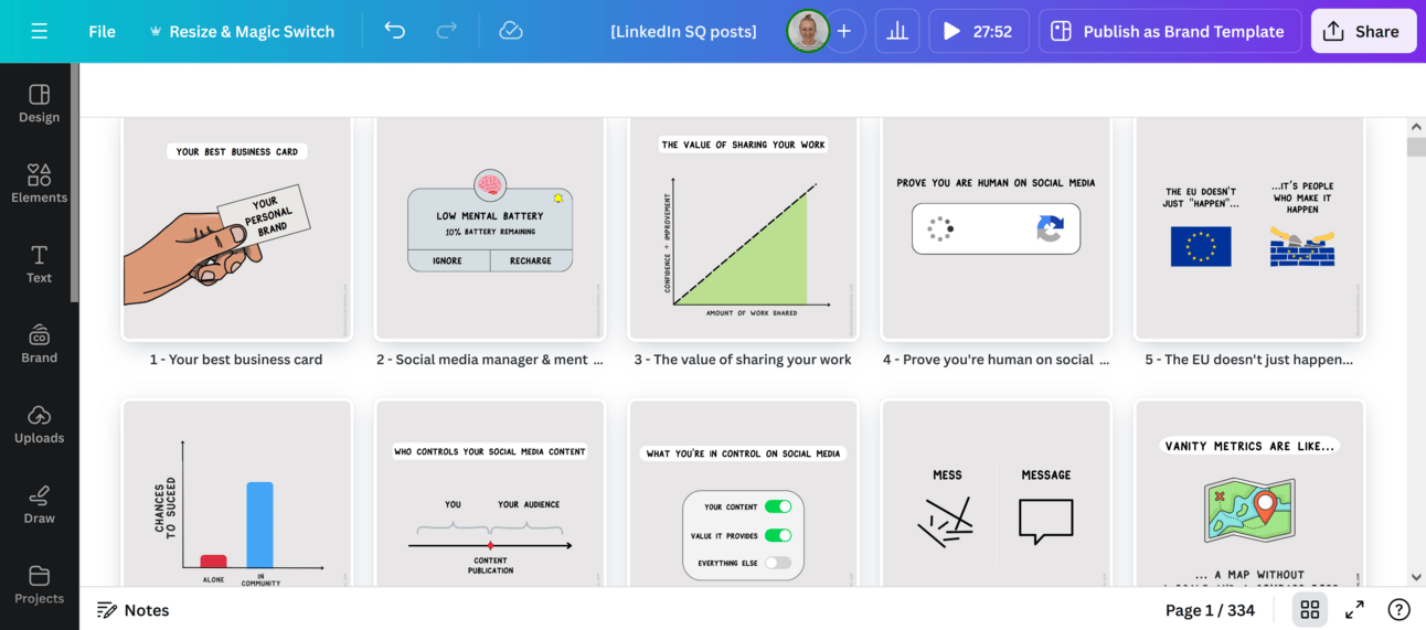
I design my visuals in Canva - the tool I’ve been using for years
When designing, I focus on minimalism: every element must serve the message, keeping the visuals clean and easy to understand. No clutter, just what’s necessary to get the point across.
I also remember a few fundamental principles:
all elements are aligned and in harmony, creating a cohesive look,
there's a clear hierarchy that guides the viewer's attention to the core message,
the visuals are small-screen friendly, making them easily viewable on any device.
To help maintain consistency and save time, I continue building and developing a pool of visual frameworks. For instance, I often use:
and flow charts.
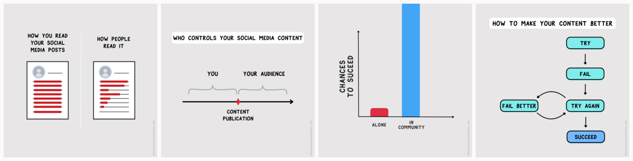
I develop a pool of available visual frameworks.
Sometimes, I use elements from familiar interfaces on our mobile phones or the internet.
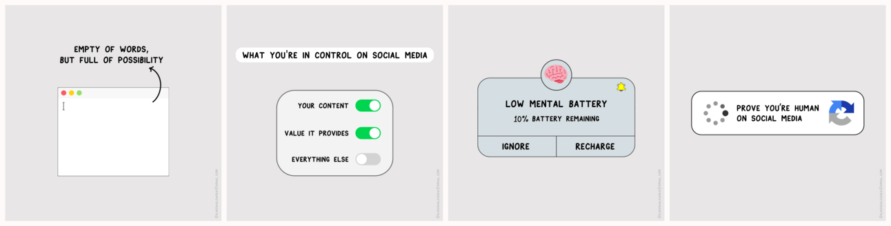
I use elements that we come across while browsing or using mobile phones.
I use visuals to talk about social media, community building and communications, but I believe that minimalistic visual language can be applied everywhere.
Look at the example of my work to support restless.brussels and its campaign to encourage expats to vote in local elections in Brussels. The result? Snappy, shareable content that resonated. You can check out the mini-case study linked here.
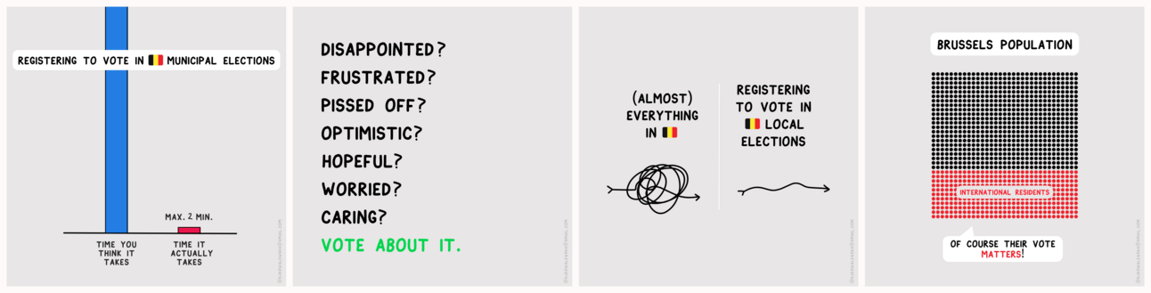
Collaboration with restless.brussels.
What I’ve learnt
Start with a sharp idea. A great visual begins with clarity.
Think audience-first. Always ask if it’s relevant, interesting, or valuable to them.
Experiment and practice. You won’t know what works until you try it.
Build in public. Share your work, gather feedback, and learn from your community.
👇 Before you go
Did you find this newsletter useful? I'd love to hear your thoughts—hit reply and let me know what resonated with you or what you'd like to see more of in future newsletters. Or you can vote below.
How did I do?Click a button below to provide feedback: |
Until next time! Stay curious!
— Kasia
PS. Know someone who’ll enjoy this newsletter? Forward it to them—it only takes a few seconds but means a lot!
Reply